
Our overall experience at Boroondara was fractured
From the website to individual products, the brand was inconsistent. The underlying issues were like an iceberg: slightly visible from the surface, but the ramifications ran much deeper than meets the eye.
As a result, customer satisfaction dipped. Product development was losing velocity. Collaboration was difficult.
My Role
As part of my government tenure one of my remits was to establish a set of guidelines to help sustain a decent cadence for delivery. I was to provide a strategy to effectively manage the experience and the user interfaces. Being able to prototype faster meant we could validate and release more frequently.
Some Key Considerations
After collating exisiting research and conducting a UI audit, it was clear that the organisation could benefit greatly from having a set style guidelines. Before jumping in head-first I wanted to validate if there was real value in it. This is what I discovered:
- There was no current design system but a plan to create one.
- There were significant benefits that could be achieved through developing a reusable UI component library or ecosystem.
- The organisation were admist a transformation and needed to be able to design with a common language and consistent aesthetic.
- There was a lot of duplication of work across delivery teams.
What’s the problem
Disjointed user interfaces Over five years and multiple production teams, our interfaces have drifted out of sync across products. This makes our products seem unpolished—or worse, untrustworthy. They don’t feel like they were designed by the same company.
Project planning is compromised and slow Reliable project estimates are difficult when code reuse is low or sporadic. Maintenance is expensive when changing an interface element requires fixing or refactoring multiple instances of the same component.
Knowledge is scattered Institutional knowledge is not well documented, so best practices are difficult to discover. And for developers eager to share their solutions, it’s not clear how or where to do it.
Limited resources There’s no central resource or team with responsibility and authority to help knit together the UI, UX, and technical underpinnings across projects.
The Objective
A design framework, a simple set of design rules that could be easily interpreted and implemented. There was a need to be able to iterate quickly and the maintenance overhead kept to a minimum.
As a team we understand the value of design systems and the ability to share an organisation’s institutional knowledge. Teams work faster, design better, and focus on new problems instead of rehashing the old. To a group of stakeholders we presented this perceived value through the power of benefits.
- Allows scalability in design
- Manage design and development debt - reduce non-reusable and inconsistent styles
- Provides the ability to design consistently
- More efficient shipping cycle
- Prototype and iterate faster
- Release more often
- Instills confidence in teams to deliver accurately
- Centralised code base / library
In summary, we wanted a cohesive & consistent user experience
Usability consultant Jakob Nielsen quipped,
“Consistency is one of the most powerful usability principles: when things always behave the same, users don’t have to worry about what will happen. Instead, they know what will happen based on earlier experience”
The Road to Success
With our roadmap primed, we were ready to lay the foundations to our new design ecosystem.
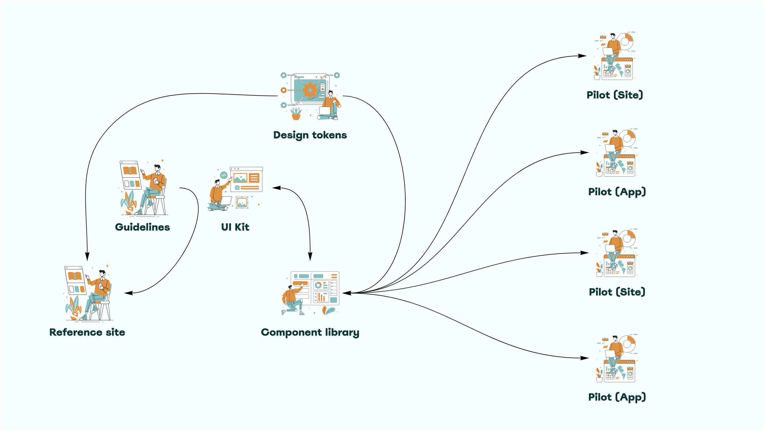
The Atomic Design Principle

Following the Atomic method, my Senior UI Designer and I began to design the foundational UI elements to serve as our base styles. The library is categorised into Atoms, Molecules, Organisms and Templates.

Design tuned to the needs of the organisation
It’s not enough for a design system to provide generic components. To be really valuable, Boroondara’s design ecosystem needs to make it simple for designers and developers to work with institutional + industry best practices, out-of-the-box. Here are a few topics the Boroondara design system will address that make it easier and more enticing to reach for over any other solution.
Varied visual styles across products
The new design system will include a theming architecture to support multiple visual styles.
Many tech stacks
The design system can be adopted at three levels: 1) design and development best practices, 2) coded visual styles, or 3) full UI component level. New products should start at #3 while legacy products begin at #1 and develop a roadmap toward #3.
Mobile devices
With a mobile-first, responsive perspective, the design system will increase designer and developer confidence in creating mobile web applications.
Complex workflows
The design system will solve micro-level problems so designers can focus on more complex, high value interactions.
Cross-browser compatibility
This testing will be built-in, reducing QA time and delivering rock-solid code from the get-go.
A Living Document
Ensuring design consistency and reducing frustration was high priority for the engineering team and the goals of the business. An evolving design system has helped to relieve duplication and enabled the product team to build faster with greater confidence in their outputs.
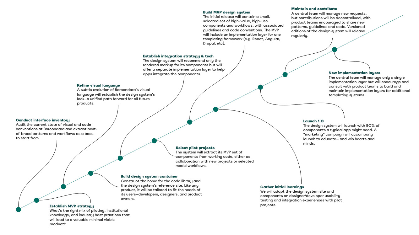
In less than six months we managed to find the right mix of piloting, knowledge and industry best practices to feed into our minimum viable product strategy. We conducted an audit of visual and code conventions and extracted the best-of-breed patterns and workflows. The visual language has been refined and we have defined a set of pilot projects to design for.
The system continues to evolve and the best way to keep creating is to tackle products that are already on our roadmap and harvest components into a system as a natural output. Rather than thinking of these products as standalone, they are considered pilots for growing a design system. As we progress further along our roadmap, the more mature our design system becomes.